
The topic of Shareable Diagnostics: Generating HTML Reports From Production Profiling is currently the subject of lively debate — readers and analysts are keeping a close eye on developments.
This is taking place in a dynamic environment: companies’ decisions and competitors’ reactions can quickly change the picture.
You’ve just diagnosed a production performance issue. loop-detective told you that processPayload at /app/handlers/payment.js:127 consumed 54% of CPU, that three HTTP calls to the payment gateway averaged 1.8 seconds, and that the event loop lagged 12 times during the 30-second capture.
Now you need to share this with your team. You copy-paste the terminal output into Slack. The ANSI color codes turn into garbage. The bar charts become meaningless characters. The carefully formatted report becomes an unreadable wall of text.
Terminal output is perfect for the person running the diagnostic. It’s immediate, it’s colorful, it’s right there. But it has three fundamental limitations:
It doesn’t travel well. ANSI escape codes render as [31m in Slack, email, Jira, and most text editors. You lose all formatting.
It’s not interactive. You can’t collapse a call stack you don’t care about. You can’t hover over a lag event to see its timestamp. You can’t sort the function table by percentage.
It’s ephemeral. Once the terminal scrolls past, it’s gone. You can redirect to a file, but then you have a plain text file with escape codes.
JSON output (–json) solves the data portability problem but creates a readability problem. Nobody wants to read a 500-line JSON blob in a Slack thread.
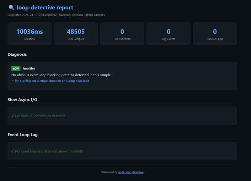
The report is a single self-contained HTML file with a dark theme inspired by GitHub’s UI. No external CSS, no JavaScript CDN links, no images to load. It works offline, it works on any device, and it’s about 15-20KB for a typical report.
Five cards at the top showing the key numbers at a glance: profiling duration, CPU sample count, number of hot functions, lag event count, and slow I/O operation count. You can tell in one second whether this report is interesting.
Each detected pattern gets a colored severity badge (HIGH in red, MED in yellow, LOW in green), a description, the code location, and a suggested fix. This is the same information as the terminal output, but formatted for readability.
A sortable table with visual percentage bars. The bars are color-coded: red for >50% CPU, yellow for >20%, green for the rest. Each row shows the function name, a visual bar, self time in milliseconds, and the file location.
The top blocking functions have expandable call stacks. Click to expand, click again to collapse. This keeps the report compact by default while making the full detail available on demand. The target function is highlighted in yellow.
Grouped by type (HTTP, FETCH, DNS, TCP), then by target. Each group shows call count, total duration, average, and max. Caller stack traces are shown inline. Error counts get a red badge.
A visual timeline of lag events represented as colored dots. The dot size scales with lag severity. Hover over any dot to see the exact lag duration and timestamp. Below the timeline, a table aggregates lag events by code location.
The report must work when attached to a Jira ticket, emailed to a colleague, or opened six months later during a post-mortem. External dependencies (CDN-hosted CSS, JavaScript libraries, web fonts) break in all these scenarios. Corporate firewalls block CDNs. Offline access fails. Links rot.
Every byte of CSS and JavaScript is inline in the HTML file. You can put it on a USB drive and it works.
Developers spend their days looking at dark-themed editors and terminals. A bright white report is jarring. The GitHub-inspired dark theme (#0d1117 background, #c9d1d9 text) feels native to the developer workflow.
A report with 5 expanded call stacks, each 10-15 frames deep, is overwhelming. Most of the time you only care about one or two stacks. Collapsible sections let you scan the targets quickly and expand only what’s relevant.
We considered generating a report with charts (line graphs for lag over time, pie charts for CPU distribution). But charts require a charting library (Chart.js, D3, etc.), which would either bloat the file or require a CDN. The current approach — colored bars, sized dots, tables — conveys the same information with pure HTML and CSS.
If you need charts, use –json and feed the data to your preferred visualization tool.
The HTML report generator (src/html-report.js) is a pure function that takes analysis data and returns an HTML string:
Each section is rendered by a dedicated function. All user-provided strings (function names, file paths, error messages) are HTML-escaped to prevent XSS — even though the report is generated locally, it’s good practice.
Attach the HTML file to the post-mortem document. Six months later, anyone can open it and see exactly what was happening: which functions were hot, which I/O was slow, when the lag events occurred.
Found a performance regression? Profile the old and new versions, generate HTML reports for both, and attach them to the pull request. The reviewer can open both files side by side and compare.
Build a simple file server over the reports directory and you have a performance history dashboard.
Open report.html in your browser. Share it with your team. Attach it to the ticket. The diagnostic data is no longer trapped in your terminal.
Are you sure you want to hide this comment? It will become hidden in your post, but will still be visible via the comment’s permalink.
For further actions, you may consider blocking this person and/or reporting abuse
DEV Community — A space to discuss and keep up software development and manage your software career
Built on Forem — the open source software that powers DEV and other inclusive communities.
Why it matters
News like this often changes audience expectations and competitors’ plans.
When one player makes a move, others usually react — it is worth reading the event in context.
What to look out for next
The full picture will become clear in time, but the headline already shows the dynamics of the industry.
Further statements and user reactions will add to the story.